lo selzga homepage of mike richman
building a covid-19 dashboard
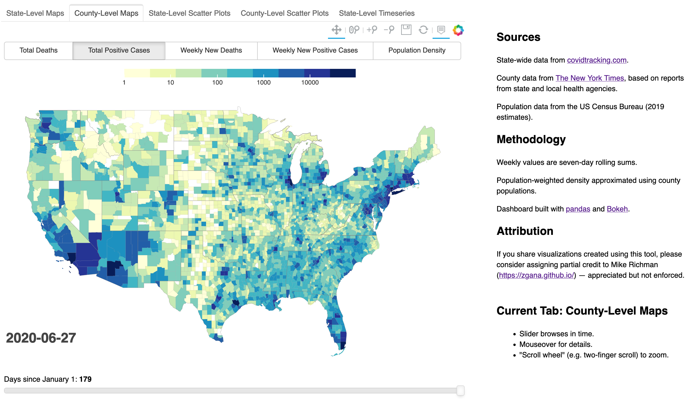
This past May, I wrote about the overwhelming COVID-19 outbreak in New York and the correlation between population-weighted density and positive cases/deaths. In that post, custom plots gave the most insight into the situation. But as an experienced coder yet newcomer to the data science scene, I was most excited about the interactive maps. (The data itself is horrifying; it’s just the plots that are exciting.) Bokeh is cool!
This dashboard is the result of that excitement. This repository contains the implementation.
In this post, I want to dig into some of the technical challenges and solutions involved in creating the dashboard. In a future post, I’ll reflect on the exercise at a higher level: what is the value of such a dashboard, relative to other approaches or other possible uses of one’s time?
workflow
My initial investigations into the US outbreak were contained in a single giant notebook. Plots lead to questions; questions lead to additional datasets; additional datasets lead to new plots. Those additional datasets were sourced from whatever appeared atop a Google search and in several cases were not particularly future-proof. This was not a sustainable way to build a dashboard to update regularly.
The first step was to identify datasets of interest and express the required ETL in scripts. We need some relatively static data — population, land area, geographic boundaries — as well as daily updated COVID-19 statistics. I tried to prefer relatively robust sources such as the US Census, but used other sources where more convenient.
This script, along with some Python helper scripts, prepares the static data:
- County-level population data (US Census)
- County-level land area (US Census)
- County-level geography (US Census)
- FIPS mapping for identifying ids with counties (US Census)
- State-level geography (Folium examples)
- State name/abbreviation mapping (Wikipedia, this was lazy)
This script prepares the latest COVID-19 data:
- County-level data (New York Times on GitHub)
- State-level data (covidtracking.com, specifically this Google Docs spreadsheet)
Along the way, we need to clean the datasets, standardize feature names, and perform joins to obtain analysis-ready files. See the linked scripts for details.
Finally, this
notebook
(better viewed on Jupyter
nbviewer)
constructs the dashboard. The notebook invokes prep-latest-data.py at the
top and inserts a Google Analytics tag at the bottom, so a restart + run-all is
sufficient to refresh the dashboard with the latest data.
The dashboard is exported as a standalone HTML file. Unfortunately, it’s pretty fat — currently 55 MB — so this puts some stress on my strategy of uploading the whole thing as a static asset on GitHub Pages. I’ve scaled back from an original target of daily updates to a more comfortable ~weekly upload, but it’s still more data-as-code than I should be uploading on GitHub. If I pursue more dashboards like this one, I’ll want to look into alternative hosting options.
implementation using bokeh
I want to walk through the dashboard construction in some detail because I needed several tricks that, as far as I can tell, are not widely discussed online. I’ll abbreviate because there is a fair amount of boilerplate and aesthetic detailing, so if you try this and have any trouble, please see the notebook for code that actually runs end-to-end.
The high-level strategy is to construct a series of tabs with different visualizations. Each tab displays a layout with a plot and some control widgets.
In most documentation, I’ve seen each Bokeh object imported specifically. I think that would drive me crazy, so I start by giving short names to key modules:
import bokeh.plotting as bp
import bokeh.models as bm
import bokeh.layouts as bl
import bokeh.models.widgets as bmw
from bokeh.palettes import brewer
maps and scatterplots
Maps with time sliders got me to this point, and naturally they are front-and-center on the dashboard. These require a relatively empty canvas:
p = bp.figure(
    title='', tools='pan,wheel_zoom,zoom_in,zoom_out,save,reset',
    plot_height=height, plot_width=width,
    active_scroll='wheel_zoom')
p.xaxis.visible = False
p.yaxis.visible = False
p.xgrid.visible = False
p.ygrid.visible = False
p.outline_line_color = None
To draw our maps, we represent the data as a GeoJSONDataSource:
# data is prepared as described below
# and has been joined with a GeoPandas DataFrame
# containing a 'geometry' column
geosource = bm.GeoJSONDataSource(geojson=data.to_json())
The map is then drawn easily enough:
# assign colors on log scale
# highs is an array with the max value for each feature
color_mapper = bm.LogColorMapper(palette=palette, low=low, high=highs[0])

# make the map
# 'xs' and 'ys' are implicit properties of geosource,
# based on 'geometry'
patches = p.patches(
    'xs', 'ys', source=geosource,
    line_color='gray',
    line_width=0.25 if county else 0,
    line_alpha=.3,
    fill_color = {'field': f'deaths_{init_day}',
                  'transform' : color_mapper})
The fill_color argument here hints at a key challenge in writing JavaScript
callbacks to update the maps. Mapping requires the data to be represented to
Bokeh as a
GeoJSONDataSource.
Unfortunately, I could not discern from the Bokeh JavaScript
Callbacks
how to manipulate this representation. On Stack Overflow, all I found was
lots
and
lots
and
lots
(etc.) of tips on working with the more commonly used
ColumnDataSource.
If the data source isn’t easily modified in place, then we can instead modify
the patches and hover tooltips to point to the correct data. This means we
need to pre-arrange the data with one row per state/county and one column for
each (feature, date) pair — plus one additional column for each
time-independent feature such as population or population density. This means
we have data columns like deaths_1, deaths_193, positives_37,
population_density, etc.
To make the plot interactive, we define tooltips, labels, and controls (again, see the notebook for details):
hover = bm.HoverTool(renderers=[patches], ...)
color_bar = bm.ColorBar(color_mapper=color_mapper, ...)
date_label = bm.Label(...)
column_button = bm.RadioButtonGroup(...)
slider = bm.Slider(...)
Some are added directly to the plot, and then the controls and plot are added to a layout:
p.add_tools(hover)
p.add_layout(color_bar, 'above')
p.add_layout(date_label)
layout = bl.gridplot([[column_button], [p], [slider]])
The controls update the plot through a lengthy JavaScript callback:
# define callback
cb_update = bm.CustomJS(
    args=dict(patches=patches, hover=hover, slider=slider, button=column_button,
              source=geosource, label=date_label, dates=dates, county=county,
              color_mapper=color_mapper, highs=highs),
    code="""
    // determine column and, if necessary, date suffix
    var selected_day = slider.value;
    var active = button.active;
    var column = ['deaths', 'positives', 'deaths_weekly', 'positives_weekly',
                  'population_density', 'population_weighted_density'][active];
    var day;
    if (active <= 3) {
        day = column + '_' + selected_day;
    }
    else {
        day = column;
    }

    // update patches
    patches.glyph.fill_color.field = day;

    // update date label
    label.text = dates[selected_day];

    // update tooltips
    // county is a bool for whether this is a county rather than state map
    if (county) {
        hover.tooltips = [ ["Location", "@county_name, @state_name"] ];
    }
    else {
        hover.tooltips = [ ["State:", "@state_name"] ];
    }
    if ((button.active == 2) || (button.active == 3)) {
        // weekly
        hover.tooltips.push(["New Deaths:", "@deaths_weekly_" + selected_day + "{20.0f}"]);
        hover.tooltips.push(["New Positive Cases:", "@positives_weekly_" + selected_day + "{20.0f}"]);
    }
    else {
        // cumulative
        hover.tooltips.push(["Deaths:", "@deaths_" + selected_day]);
        hover.tooltips.push(["Positive Cases:", "@positives_" + selected_day]);
    }
    hover.tooltips.push(["Population:", "@population"]);
    hover.tooltips.push(["Population Density:", "@population_density{20.0f}"]);
    if (!county) {
        hover.tooltips.push(
            ["Population-Weighted Density:", "@population_weighted_density{20.0f}"],
        )
    }

    // set color scale
    color_mapper.high = highs[button.active];

    // update everything affected
    source.change.emit();
    """)

# bind slider and buttongroup to callback
slider.js_on_change('value', cb_update)
column_button.js_on_click(cb_update)
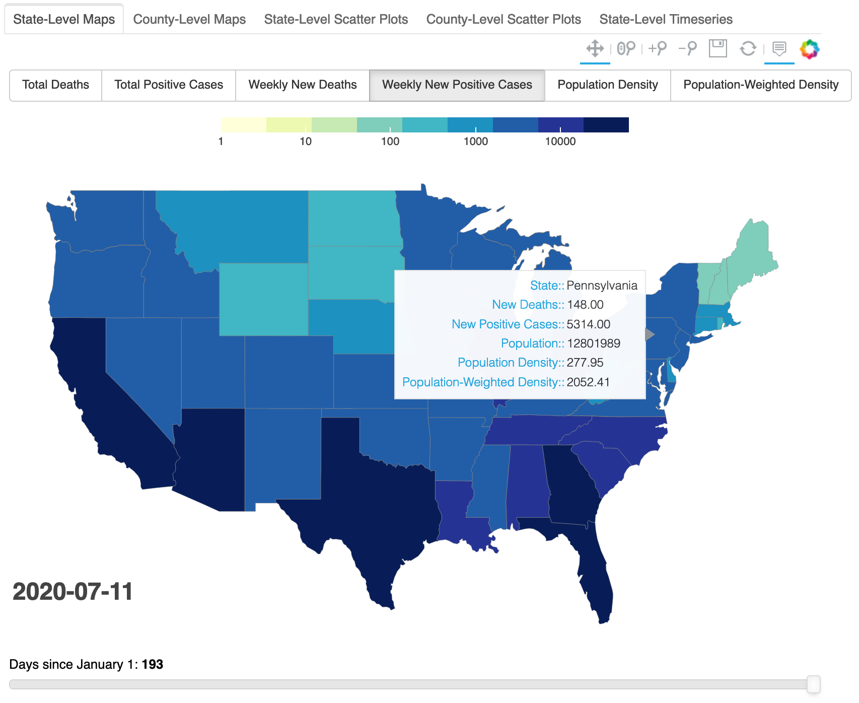
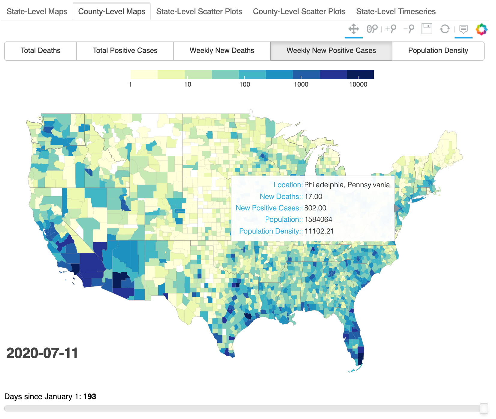
The first two tabs in my dashboard offer state-level and county-level maps.
state-level maps
county-level maps
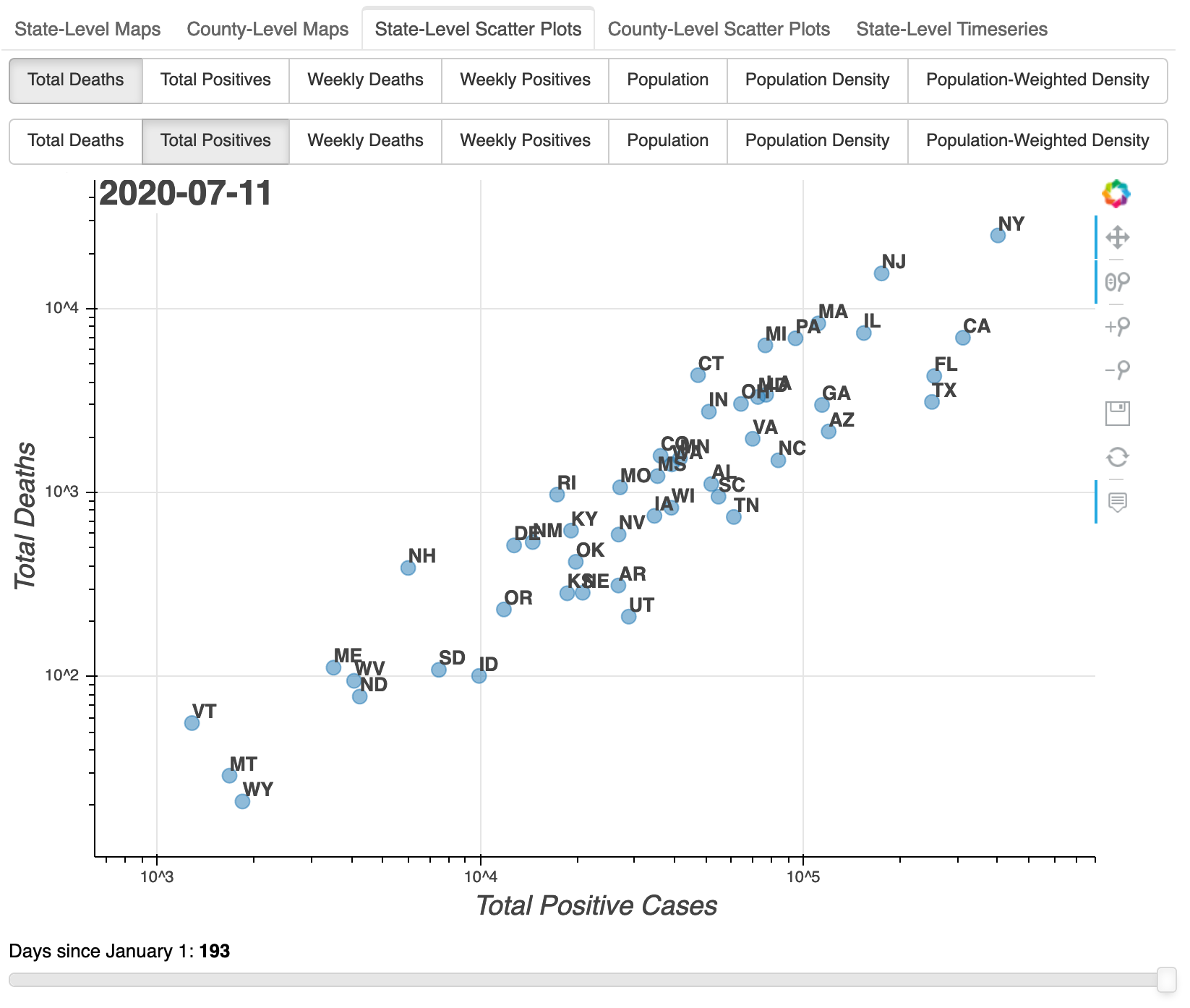
The following two tabs offer state-level and county-level scatterplots, again with a date slider.
state-level scatter plots
county-level scatter plots
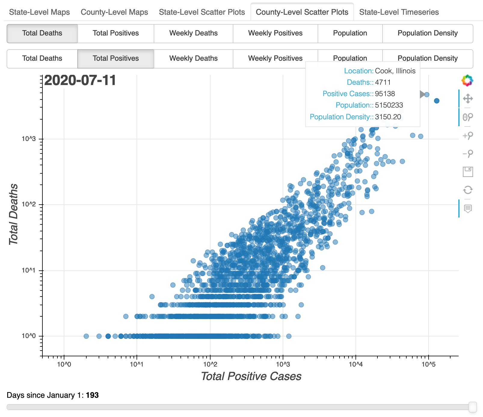
These could have been implemented using ColumnDataSource, but I recycled the
GeoJSONDataSource instances since they were already available. Aside from
having separate feature selection buttongroups for the $x$ and $y$ axes, the
scatter plots are implemented very similarly to the maps.
timeseries plots
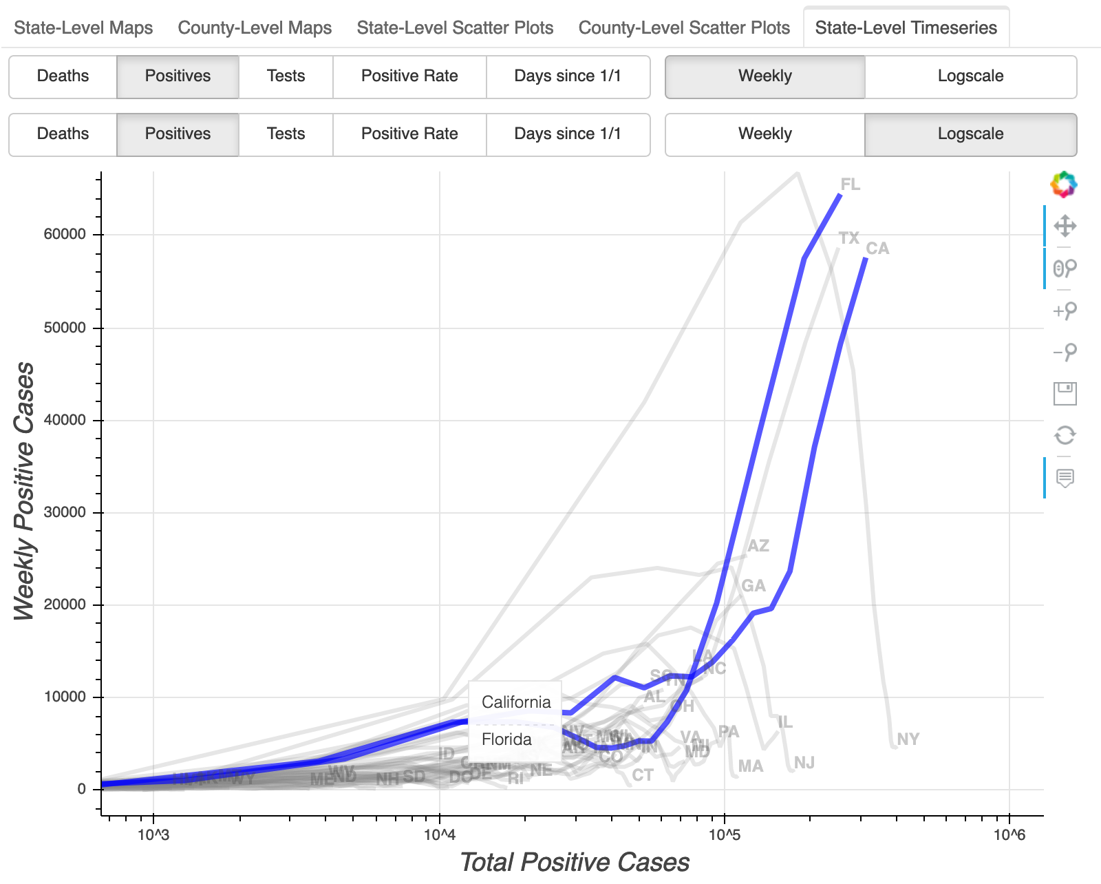
The last tab is a later addition: state-level timeseries plots. Like in the scatterplots, the user can select the $x$ and $y$ axes. But instead of a setting the date with a slider, the entire timeseries is shown as a curve for each state. Axis specification is more flexible: the user can toggle “weekly” as opposed to cumulative, and “logscale” as opposed to linear, independently from selecting the features to be plotted. The hover tool highlights the curve(s) under the cursor and indicates the state name(s).
The logscale toggles were nontrivial to implement because there is, apparently, no way to change existing Bokeh axis types in a Javascript callback. Instead, plots for each linear/log combination needed to be constructed in a loop:
all_ps = []
for xtype in ('log', 'linear'):
    ps = []
    for ytype in ('log', 'linear'):
        p = bp.figure(x_axis_type=xtype, y_axis_type=ytype, ...)
        # ...
        lines = p.multi_line(xs='xs', ys='ys', source=source, ...)
        # ...
        ps.append(p)
    all_ps.append(ps)
((p0, p1), (p2, p3)) = all_ps
Buttons control the feature (deaths, positives, etc.) and checkbuttons
toggle “weekly” and “logscale”:
# button labels include 'Deaths', 'Positives', etc.
xbutton = bm.RadioButtonGroup(
    labels=button_labels,
    active=len(button_labels)-1,
    sizing_mode='stretch_width')
ybutton = bm.RadioButtonGroup(
    labels=button_labels,
    active=0,
    sizing_mode='stretch_width')

# check labels include 'Weekly' and 'Logscale'
xcheck = bm.CheckboxButtonGroup(labels=check_labels, active=[])
ycheck = bm.CheckboxButtonGroup(labels=check_labels, active=[1])

# layout brings it all together
layout = bl.layout([bl.row(ybutton, ycheck), bl.row(xbutton, xcheck), [p2]])
Another lengthy callback links the controls to the plot:
cb = bm.CustomJS(
    args=dict(source=source, layout=layout,
              xbutton=xbutton, ybutton=ybutton,
              xcheck=xcheck, ycheck=ycheck,
              columns=columns, labels=labels,
              mins=mins, maxs=maxs,
              figs = all_ps,
              xaxiss = [p0.xaxis[0], p1.xaxis[0], p2.xaxis[0], p3.xaxis[0]],
              yaxiss = [p0.yaxis[0], p1.yaxis[0], p2.yaxis[0], p3.yaxis[0]],
             ),
    code="""
    // get selected feature indices
    var xactive = xbutton.active;
    var yactive = ybutton.active;

    // hack: if "weekly", use a different feature from the list
    if (xcheck.active.includes(0)) {
        xactive += 5;
    }
    if (ycheck.active.includes(0)) {
        yactive += 5;
    }

    // get features and axis labels
    var xcolumn = columns[xactive];
    var xlabel = labels[xactive];
    var ycolumn = columns[yactive];
    var ylabel = labels[yactive];

    // put selected features into arrays used by plot
    source.data['xs'] = source.data[xcolumn];
    source.data['ys'] = source.data[ycolumn];

    // set axis labels
    for (var xaxis of xaxiss) {
        xaxis.axis_label = xlabel;
    }
    for (var yaxis of yaxiss) {
        yaxis.axis_label = ylabel;
    }

    // set axis limits
    // mins, maxs precomputed
    for (var ix of [0, 1]) {
        figs[ix][0].y_range.start = mins[yactive] / 2;
        figs[ix][0].y_range.end = maxs[yactive] * 2;
        figs[ix][1].y_range.start = mins[yactive] / 1.1;
        figs[ix][1].y_range.end = maxs[yactive] * 1.1;
    }
    for (var iy of [0, 1]) {
        figs[0][iy].x_range.start = mins[xactive] / 2;
        figs[0][iy].x_range.end = maxs[xactive] * 2;
        figs[1][iy].x_range.start = mins[xactive] / 1.1;
        figs[1][iy].x_range.end = maxs[xactive] * 1.1;
    }

    // set correct (linear/log) x (linear/log) combo
    var xind = (xcheck.active.includes(1)) ? 0 : 1;
    var yind = (ycheck.active.includes(1)) ? 0 : 1;
    layout.children[2].children = [figs[xind][yind]];

    // update everything affected
    source.change.emit();
    """ )

# bind controls to callback
xbutton.js_on_click(cb)
ybutton.js_on_click(cb)
xcheck.js_on_click(cb)
ycheck.js_on_click(cb)
for p in np.ravel(all_ps):
    p.js_on_event('reset', cb)
state-level timeseries
dashboard assembly
As mentioned above, the dashboard consists mainly of a set of tabs. To build the dashboard, we construct separate layouts using functions based on the ideas above, and then we assemble the tab panels:
# construct the 5 separate layouts
map1 = make_map()
map2 = make_map(county=True)
sc1 = make_scatter()
sc2 = make_scatter(county=True)
ts1 = make_timeseries()

# pack these into tabs
tabs = []
tabs.append(bmw.Panel(child=map1, title='State-Level Maps'))
tabs.append(bmw.Panel(child=map2, title='County-Level Maps'))
tabs.append(bmw.Panel(child=sc1, title='State-Level Scatter Plots'))
tabs.append(bmw.Panel(child=sc2, title='County-Level Scatter Plots'))
tabs.append(bmw.Panel(child=ts1, title='State-Level Timeseries'))
tabs = bmw.Tabs(tabs=tabs)
The last step is to include some basic citations and usage documentation. We start with a general writeup plus instructions for each interface type:
general_info = bmw.Div(text="""[HTML markup]""", width=350)
map_text = """[HTML markup]"""
scatter_text = """[HTML markup]"""
timeseries_text = """[HTML markup]"""
We combine the interface docs with tab-specific headers:
header_texts = [
    f'<h2>Current Tab: {h}</h2>'
    for h in ['State-Level Maps', 'County-Level Maps',
              'State-Level Scatter', 'County-Level Scatter',
              'State-Level Timeseries']]
info_texts = [map_text, map_text, scatter_text, scatter_text, timeseries_text]
info_texts = [h+i for (h, i) in zip(header_texts, info_texts)]
tab_info = bmw.Div(text=info_texts[0], width=350)
The tab info Div needs to be updated on tab changes:
cb_tab_info = bm.CustomJS(
    args=dict(tabs=tabs, tab_info=tab_info, texts=info_texts),
    code="""
    tab_info.text = texts[tabs.active];
    """
)
tabs.js_on_change('active', cb_tab_info)
Finally, we pack it all into a single layout:
# space between general and tab-specific info
vfiller = bmw.Div(width=10)
info = bl.column([vfiller, general_info, tab_info])

# space between interface and info
hfiller = bmw.Div(width=40)
layout = bl.row([tabs, hfiller, info])
closing thoughts
Bokeh exposes almost all of its functionality through a JavaScript interface. This provides enormous flexibility in building interactive interfaces. However, the documentation is somewhat lacking. For all the reference and examples given, there isn’t necessarily a definitive and complete specification for each object.
Fortunately Javascript is a dynamic language, and every web browser offers
tools to inspect the internals. Several times in the development of this
dashboard, I got stuck while working on a JavaScript callback. Sometimes that
was because I just don’t know all that much JavaScript. Other times it was
unclear how an object would translate from Bokeh+Python to Bokeh+JavaScript.
But between console.log() and the object inspector, I was able to iteratively
hone in on the properties or methods I was looking for.
It was definitely fun to go this deep into Bokeh for this project. In my next post, I’ll discuss why the most useful work here was actually the prerequisite ETL scripts.
Posted on July 13th, 2020 by mike richman