lo selzga homepage of mike richman
against dashboards?
In my last post, I wrote about how I built a dashboard to keep tabs on COVID-19 in the US. In this post, I want to argue against the use of such a custom dashboard for that purpose.
The title of this page, “against dashboards?”, obeys Betteridge’s law of headlines, which states: “Any headline that ends in a question mark can be answered by the word no.” Dashboards can indeed be useful for non-technical / less technical users. And my own COVID-19 dashboard was useful for me as a learning tool.
This post is about why I very soon stopped maintaining my COVID-19 dashboard and might not be inclined to build similar ones in the future.
google et al
You flip on the news and see a report: novel coronavirus deaths in the US exceed N hundred thousand today, as [leader] speaks to [constituency] in [location] about [unrelated topic].
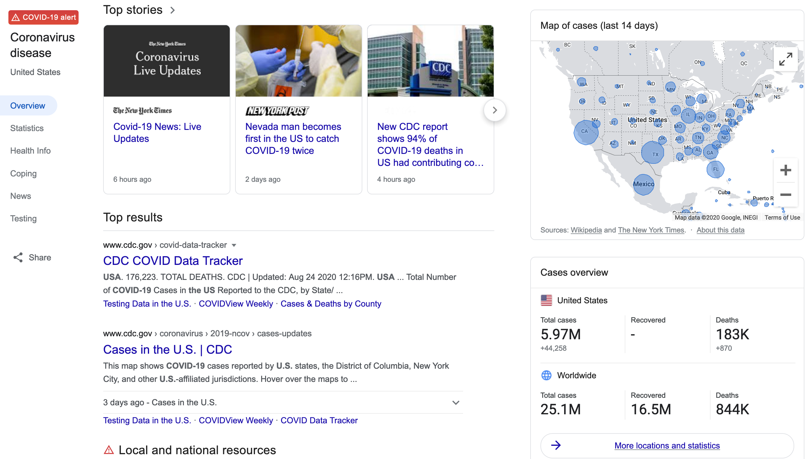
Whoa, N hundred thousand? You grab the nearest laptop and Google “[my country] covid19”. You’re instantly presented with:
- Recent news
- Links for stats, health info, etc.
- A map of recent outbreaks
- A summary of how [my country] compares with the global situation
- A link for “More locations and statistics”
If you click that “more locations and statistics” link, you’re presented with… a very nice dashboard. At the top, there’s a map of outbreak clusters at a scale set by the zoom level, and you can toggle between the last two weeks or totals to-date. There’s a summary for [my country], followed by case data for the world, [my country], and a breakdown by state/province within [my country]. It’s trivial to compare against [other country], and there’s a list of “top news” links offerring more nuanced analysis.
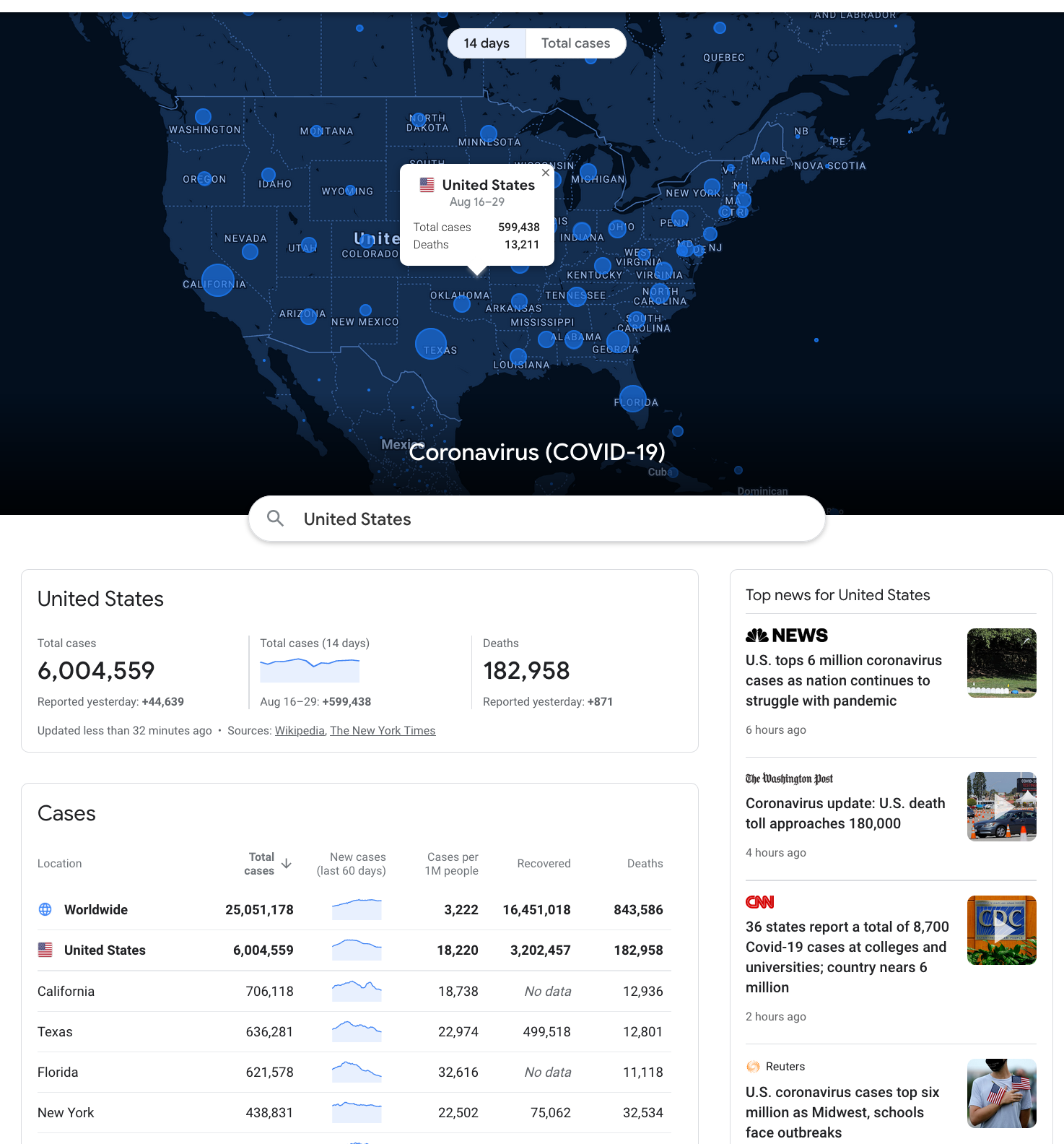
I didn’t take notes on how this app developed over time, but certainly by now it makes a ton of information easily accessible. For the casual reader, it’s plenty.
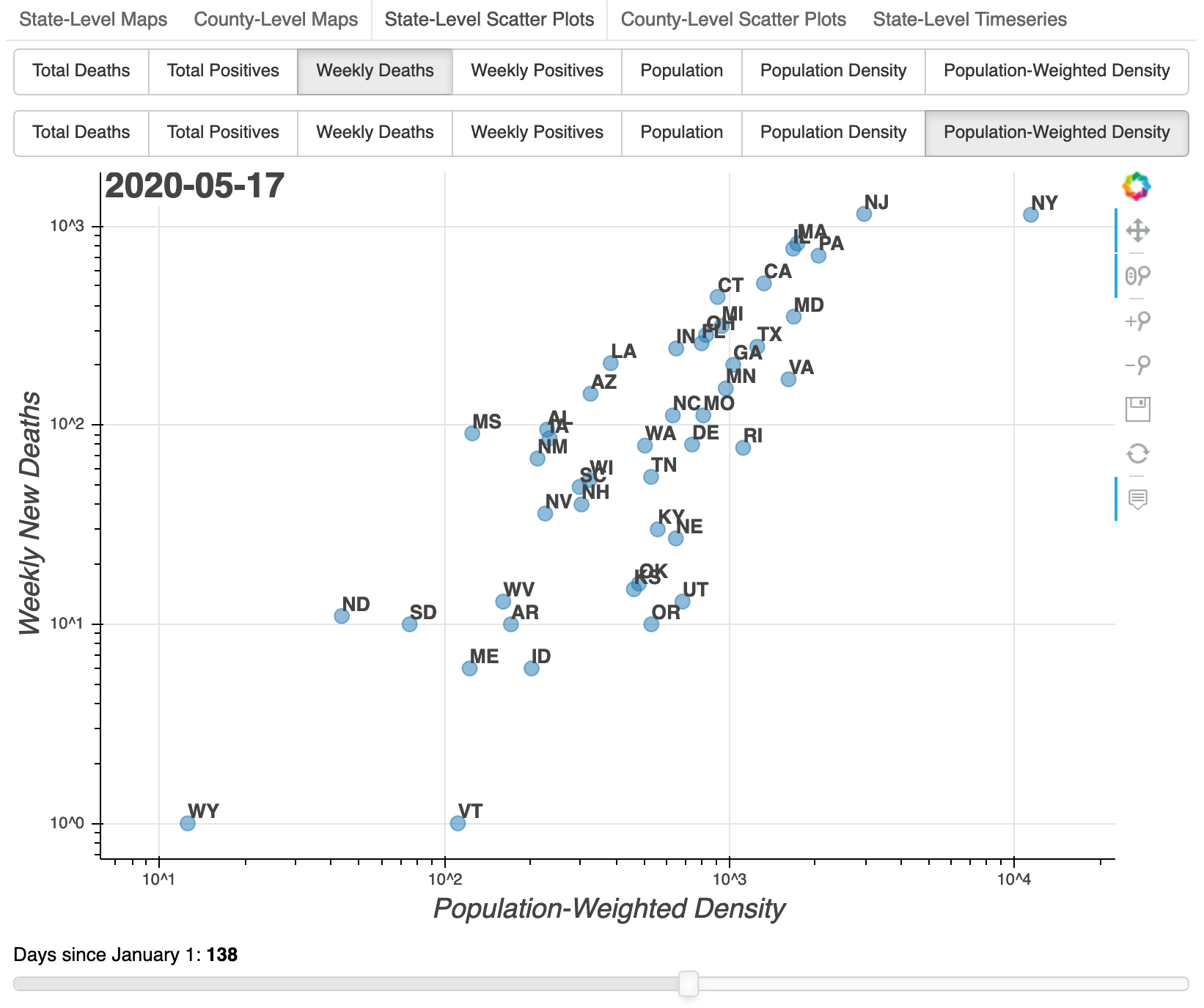
My own dashboard exposes — for the US — some information that Google’s dashboard does not. You can examine how the geographic case and death distribution changed over time, and you can scale those by population, population density, or (for US state level data) population-weighted density.
The original idea was to approach the data with the curiousity of a data scientist, and bring any resulting insights “to the masses” (i.e. my Facebook friends, etc.). But once you go beyond some fairly obvious summary data, there is a problem. …
rapid change
Earlier in the pandemic, it made sense to focus on cases and deaths versus population, population density, and population-weighted density. Since population-weighted density appeared relevant to early spread, I made it easily accessible in the dashboard.
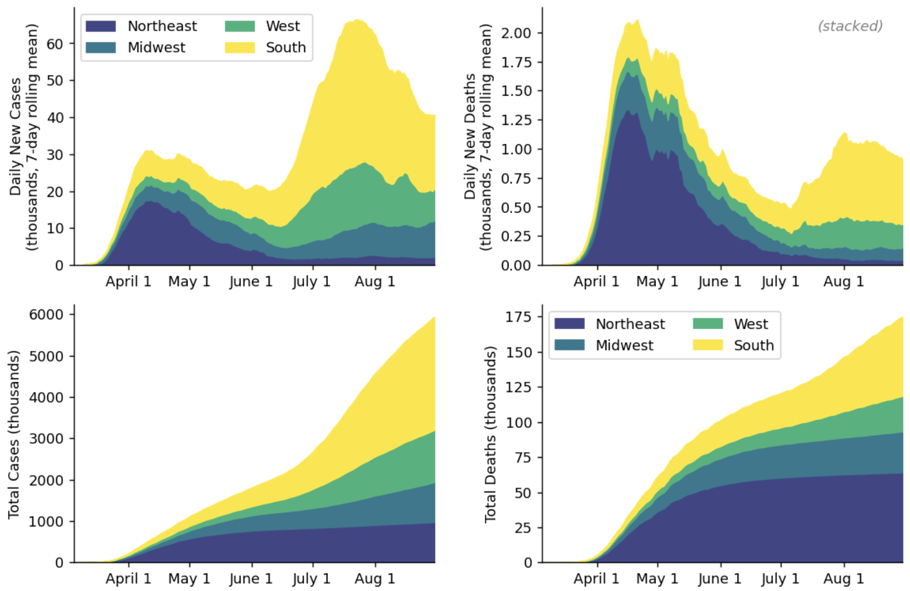
As time went by, I became interested in different aspects of the situation. In the US, at least, the pandemic has become a major political issue. There were notable regional differences in “shutdown” timing, but then there were even more stark regional differences in how and when those shutdowns were relaxed. So I started maintaining a separate notebook to produce figures such as this one which was inspired by some New York Times reporting:
There were significant outbreaks in Florida, California, Texas, and Arizona all around the same time — and as positive cases rose, the pro-virus / anti-mask online community grew skeptical. If these cases are real, where are all the deaths? So I started plotting cases and deaths together, with cases lagged to suggest the shape the death rate might take:
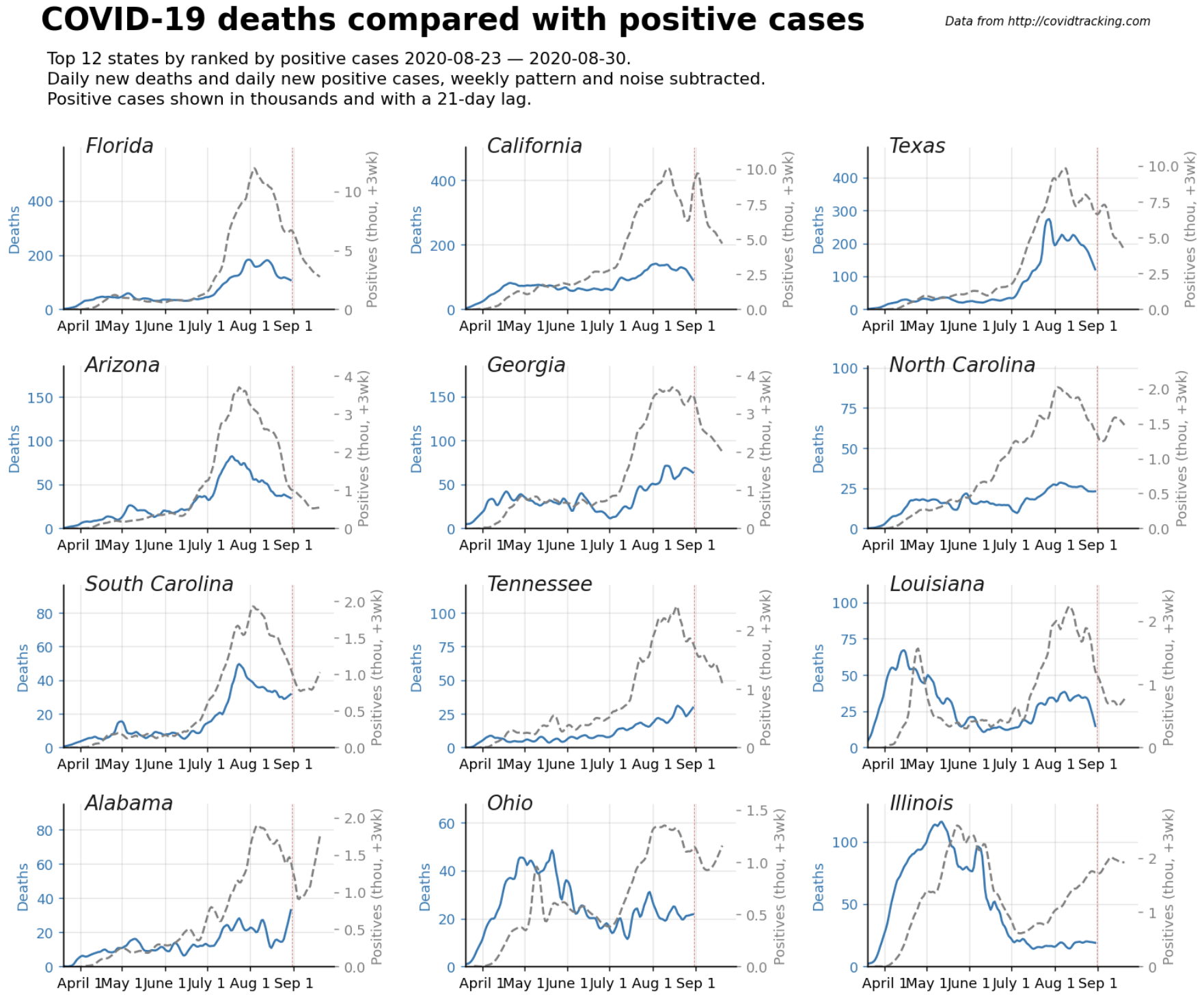
Of course, outbreaks are usually not state-wide, so it’s worth drilling down to county-level data:
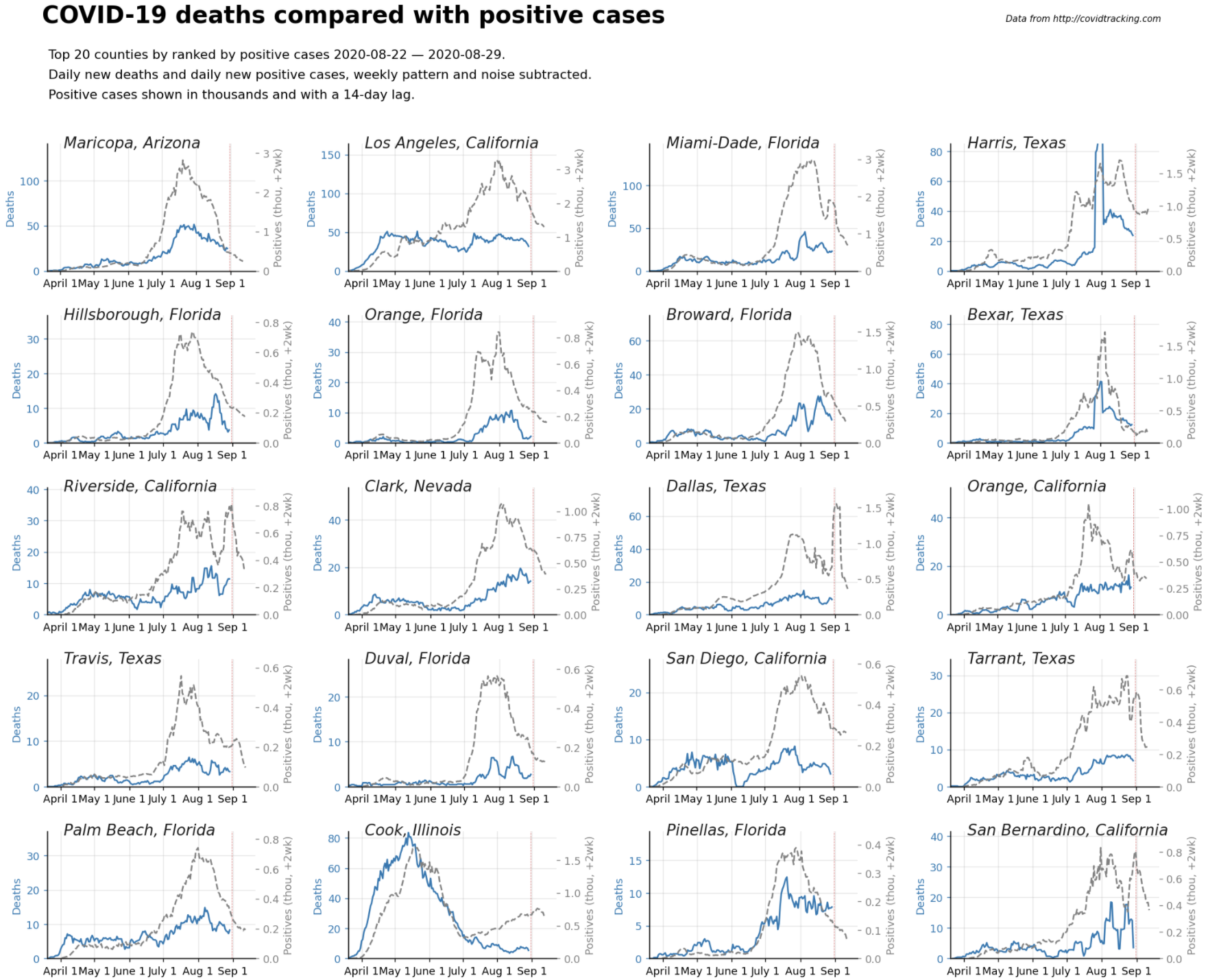
The y-scales were set to align, assuming 5% of positive cases lead to deaths — roughly what was observed in early US outbreaks. Fortunately, the true death rate is lower given sufficient testing capacity, but the shapes of these curves do tend to track in many places.
Later, I noticed that e.g. CNN was producing weekly change plots that seemed pretty compelling (which of course I needed to be able to reproduce on demand!) similar to the following:
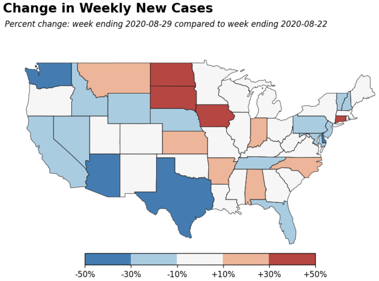
But again, county-level data gives a much more nuanced impression:
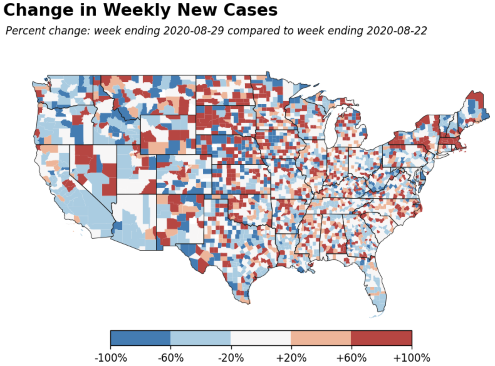
Of course, week-over-week change of 1 → 2 is a +100% change, so reasonable people take the above plots with a grain of salt. You need to look at absolute weekly values and totals to-date, control for population, etc.
Recently in the US, school openings are the latest political subtopic. I haven’t yet begun my own analysis on that topic, but I expect customized plots will again be warranted.
In a rapidly changing environment, it’s difficult to predict a priori what will be useful for analysis over the long term. Or, more precisely, it’s difficult to select, in advance, such useful features beyond the obvious ones that Google et al will always put at the world’s fingertips. Meanwhile, updating a dashboard to cover every new insight doesn’t scale well.
So yeah, I learned a lot by working on the dashboard itself, but the most useful part of the project was building the data preparation pipeline. Now I can keep myself up-to-date on this ongoing disaster in my own terms and on my own timescale, with just a one-liner to fetch the latest dataset.
side note: data volume
I’ve already justified at some length why I’m no longer maintaining a dashboard that, in hindsight, was never going to last forever. While I’m here, it’s worth revisiting one more nagging issue: data volume. The standalone HTML export of the dashboard is, at last update, 66 MB. Most of that is daily county-level case and death count data, split and normalized in various ways. It’s not a lot by most standards, but it’s quite a bit for a single version-controlled file in a free tier GitHub account. A proper web app would store the data separately, someplace where 66 MB is properly viewed as “small data”.
In a more recent project (to be discussed in a future post), I accomplish this separation by deploying a React app to this GitHub pages site, with the data stored in a public (free tier) AWS S3 bucket. A similar approach could be taken for the COVID-19 dashboard, but it would require deep refactoring if not a from-scratch rewrite.
Posted on August 31st , 2020 by mike richman