lo selzga homepage of mike richman
covid-19
The plague known as COVID-19, or “the coronavirus” (seemingly to obscure the fact that it’s another SARS), is in the news continuously these days as it spreads throughout the world wreaking havoc on individuals and societies. For technical people, it’s tempting to try to jump in and find a way to save the day.
That is not what we will be doing in this post. Instead, as an exercise in maintaining some sense of control in the face of an existential threat, we’re going to make a bunch of plots that may be helpful in understanding what is even happening right now.
tl;dr: COVID-19 continues to spread through the US at an alarming rate, and while states are currently in the process of “opening up”, there’s little evidence that we are ready to do so safely.
dataset and code
Our main data source is The COVID Tracking Project, which maintains a fairly detailed spreadsheet on US data. We will also be using county-level population data obtained from this mirror of an R-bloggers post on population-weighted density. Analysis of global data is left as an exercise for the reader and/or my future self.
The entire analysis is laid out, along with additional plots and light commentary, in this notebook — better viewed via jupyter nbviewer. I hope in future posts to go over the implementation in more detail, especially for the interactive maps below which are non-trivial to construct in such a way that they will update live in the browser without an active server running on the backend.
interactive maps
The following maps let you explore the viral spread over time. Each one has a slider in terms of days since January 22, the earliest date covered by the dataset. Mouse over different states to see totals to-date along with population data.
The first two maps show cumulative death toll and cumulative positive cases.
The next two maps show weekly rolling sums for deaths and positive cases.
I think these maps are a simple way to get a feel for how things have played out, but we’re going to need some more detailed analysis to draw any useful conclusions.
trajectory by state
How did we get here? One common way of portraying the trajectory of the virus in different geographic regions is to pick a reference point such as “date when death toll reached 100” as a per-region anchor for the date axis; then a large number of regions can be summarized with a logarithmic vertical axis. We start with this approach, looking at deaths and positive cases.
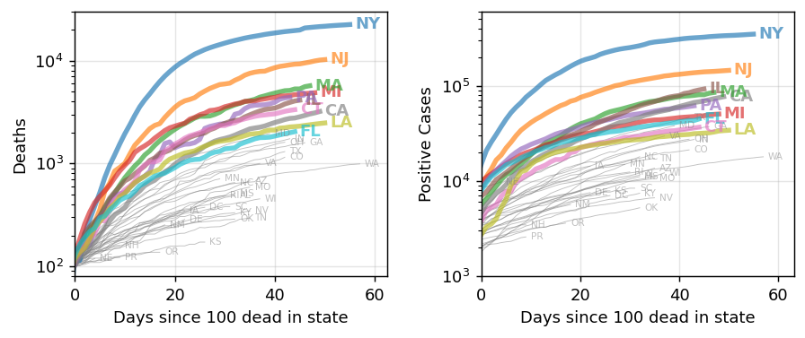
As has been widely reported, in addition to the mid-Atlantic region, there are significant outbreaks in the Midwest, Southwest, and California. The logarithmic axis shows this clearly, but it also obscures the latest trends. An alternative I haven’t seen is to show the per-state cumulative percent death toll. This lets us compare many states at once without giving up detail on the most recent data.
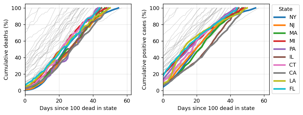
Here we see some substantial variation in number of positive tests, which may be due to variable testing practices from state to state. However, the trend in death toll is clear: with the exception of New York, the death toll is still rising approximately linear in most other states.
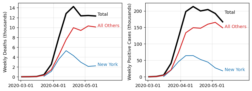
This analysis was inspired in part by this article by Erin Bromage. There she points out that while many hope to take comfort in recent week-over-week decreases in death toll, in fact that effect is mostly confined to New York. This is made clear by switching to weekly (not cumulative) numbers and explicitly breaking down New York vs the rest of the US.
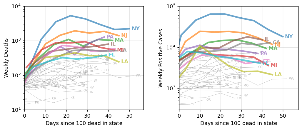
Here are the weekly numbers for all states:
It is worth noting that we are getting better about testing over time. Here we see that testing is on the rise, and the positive test rate is generally in decline.
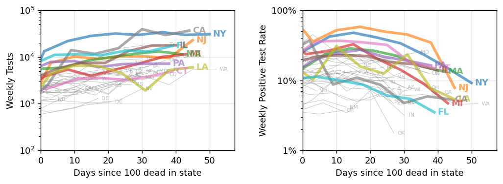
Some states are doing better than others, both in terms of testing and in recent new cases, but my takeaway remains that it is far too early to be “opening up”.
how did we get here?
Experts generally agree that SARS-CoV-2, the virus that causes the disease COVID-19, spreads through close contact between individuals. Thus, it’s worth looking for a possible connection between population and viral spread.
In my first-pass analysis, I simply pulled total populations per state from Wikipedia. However, it’s easy to see why we should look at population density — we’re concerned specifically with large numbers of people in close proximity. In particular, population-weighted density, which has recently been embraced by the US census, may be the most relevant metric because it captures the average experience of individuals in a region.
We can estimate population-weighted density by working with county-level data and aggregating up to the state level. Because it gives more weight to counties with higher population density, the population-weighted density per state is larger than the traditional population density:
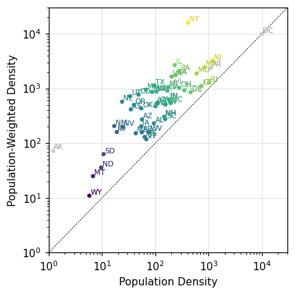
With this understanding in hand, we take a look at deaths and positive cases versus population, population density, and population-weighted density.
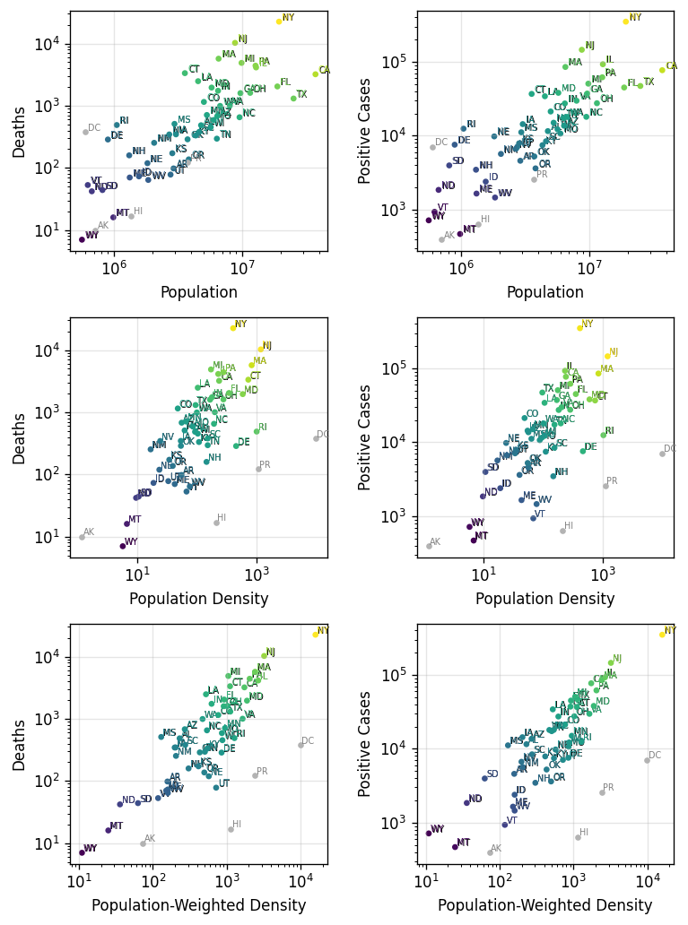
Here we see that the strength of the correlation increases from population to population density, and again from traditional population density to population-weighted density.
conclusions for now
I haven’t seen this population-weighted density finding elsewhere, though I doubt I’m the first to see it. My gut feeling is that this is scary news. There are “natural experiments” playing out as states take varied approaches to pandemic harm reduction. Are we largely helpless, tweaking things at the margins while the underlying structure of our communities determines our fate?
That is, however, a myopic take. I haven’t yet examined global data in this level of detail, but we’ve heard that some countries such as South Korea have fared far better despite very high population density.
We aren’t doomed — not by nature, anyway. What we need is a response from leadership that is commensurate with the threat, or, failing that, to take responsibility for ourselves and our communities and do everything we can to keep each other safe.
Stay home if you can; wear a mask when you need to go out. Keep your distance from your neighbors like your and their lives depend on it — because they do.
Posted on May 17th, 2020 by mike richman